Businesses are constantly seeking new strategies to optimize their processes, eliminate inefficiencies, and improve customer satisfaction as part of their continuous improvement efforts. Among the most effective tools is the Pareto Chart, a simple yet impactful graphical representation that helps organizations identify areas that require attention based on their significance. Rooted in the Pareto Principle—often called the 80/20 rule—the Pareto Chart is a staple in Lean and Six Sigma methodologies, providing clear insights into where companies should focus their improvement efforts.
The Pareto Chart enables businesses to prioritize the most significant issues, ultimately driving improvements that deliver maximum value to both customers and the organization. It is an essential component of continuous improvement initiatives, helping teams pinpoint the root causes of defects, delays, and other inefficiencies.
Origins of the Pareto Principle: The Legacy of Vilfredo Pareto
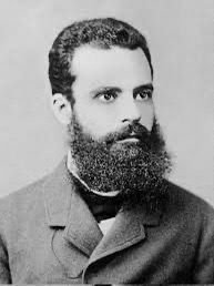
The Pareto Principle, which forms the foundation of the Pareto Chart, originated from the observations of Italian economist and sociologist Vilfredo Pareto. Born in Paris on July 15, 1848, Pareto pursued mathematics and physics at the University of Turin, graduating in 1869. After completing his studies, Pareto worked as an engineer and later became the director of an Italian railway and a manager at a major ironworks company. His interest in economics led him to study philosophical and political concepts, and by 1893, he was appointed to the chair of political economy at the University of Lausanne, Switzerland, succeeding the renowned economist Léon Walras.
It was during his career as an economist that Pareto made a groundbreaking observation. In 1896, Pareto published his work “Cours d’économie politique,” where he introduced the concept that 80% of Italy’s land was owned by 20% of its population. He later expanded this observation, noting that wealth distribution followed similar patterns across various societies and time periods. This revelation became the cornerstone of the Pareto Principle.
Pareto’s principle was later developed into the concept of Pareto-optimality, laying the groundwork for modern welfare economics. He also made significant contributions to sociology through his work “Mind and Society” (1916), where he analyzed social structures and class dynamics. Although he passed away in 1923, Pareto’s legacy continues to impact both economics and quality management, especially through the Pareto Chart.
Joseph Juran and the Pareto Chart: From Theory to Business Practice

While Vilfredo Pareto provided the foundation, it was Joseph Juran, a leading figure in quality management, who transformed the Pareto Principle into a practical tool for business improvement. Juran, often considered the father of quality control, expanded Pareto’s insights into the realm of process optimization. In the mid-20th century, Juran coined the phrase “the vital few and trivial many,” referring to the idea that 20% of causes typically lead to 80% of the problems in business processes.
While Vilfredo Pareto provided the foundation, it was Joseph Juran, a leading figure in quality management, who transformed the Pareto Principle into a practical tool for business improvement. Juran, often considered the father of quality control, expanded Pareto’s insights into the realm of process optimization. In the mid-20th century, Juran coined the phrase “the vital few and trivial many,” referring to the idea that 20% of causes typically lead to 80% of the problems in business processes.
Juran developed the Pareto Chart to help businesses identify and prioritize the “vital few” issues that have the most significant impact on overall performance. This tool allowed organizations to focus on resolving the most critical problems, leaving the “trivial many” issues for later attention. Juran’s contributions made the Pareto Chart a core component of quality improvement initiatives, especially in the Lean and Six Sigma methodologies.
Understanding the Structure of the Pareto Chart
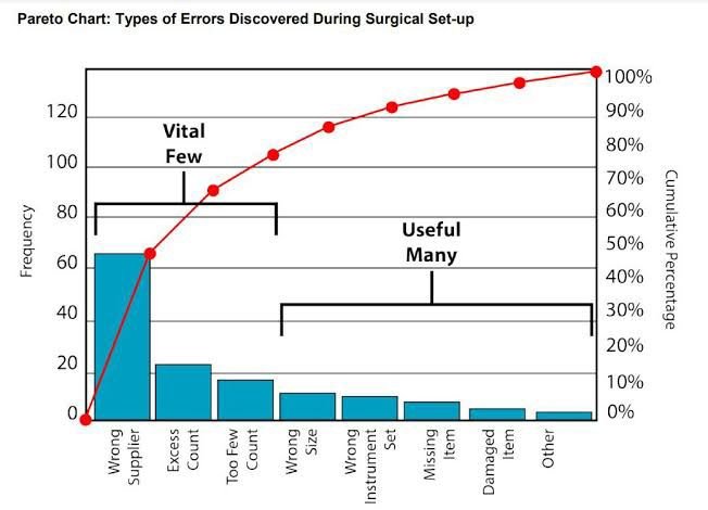
The Pareto Chart is a specialized type of bar chart that organizes data from highest to lowest based on frequency or impact. It allows businesses to quickly identify the areas that contribute the most to a particular issue. Each bar in the chart represents a category of data—such as customer complaints, defects in a manufacturing line, or sales from different products—with the height of the bar reflecting its relative contribution to the overall problem or outcome.

What sets the Pareto Chart apart from standard bar charts is its organization. While standard bar charts may list data alphabetically or by another logical sequence, the Pareto Chart is specifically ordered by the magnitude of impact. This makes it easier for teams to focus on the most pressing problems. Additionally, a cumulative frequency line is often included to visually represent the total impact of all categories combined.
Applications of Pareto Charts in Lean and Six Sigma Methodologies
The Pareto Chart is an integral tool in Lean and Six Sigma, both of which focus on improving business processes. Lean methodology aims to eliminate waste and deliver value from the customer’s perspective, while Six Sigma focuses on reducing defects and minimizing variability in processes. When these two methodologies are combined in Lean Six Sigma, the Pareto Chart plays a vital role in identifying root causes of inefficiencies and prioritizing improvements.
In Lean manufacturing, Pareto Charts are often used to analyze defects in production lines. For example, a team might use a Pareto Chart to discover that 80% of product defects stem from just 20% of the manufacturing issues. With this information, they can focus on resolving those key issues, improving product quality and efficiency.
In Six Sigma, the Pareto Chart is used to identify the most significant sources of variability in a process. By quantifying the impact of each source of variability, teams can prioritize efforts to reduce defects and improve process stability. This method aligns perfectly with the Six Sigma goal of achieving near-perfect processes by eliminating waste and minimizing errors.
Practical Examples of Pareto Charts in Various Industries
The Pareto Chart’s versatility allows it to be applied across many industries, from manufacturing to healthcare to customer service. In manufacturing, the chart helps identify the most common sources of defects, enabling teams to focus their improvement efforts on areas that will have the greatest impact on product quality. For example, a car manufacturer may use a Pareto Chart to identify that 80% of product recalls are due to just a few specific defects.
In healthcare, Pareto Charts are used to analyze the causes of medical errors. A hospital might create a Pareto Chart to determine that 80% of medication errors come from 20% of causes, such as incorrect dosages or miscommunication between staff. This insight allows the hospital to implement targeted interventions that improve patient safety.
In customer service, Pareto Charts can help teams address the most frequent sources of customer dissatisfaction. A call center, for instance, might find that 80% of complaints are related to just a few issues, such as long wait times or incorrect billing. By focusing on these problems, the company can significantly enhance customer satisfaction.
Distinguishing the Pareto Chart from Other Charts
While the Pareto Chart may resemble other types of bar charts or histograms, it has key differences that make it more useful for prioritization. In a standard bar chart, the data may be ordered alphabetically or by another logical sequence. In contrast, the Pareto Chart specifically organizes data from the highest to lowest impact, making it easier to identify the most critical issues.
Another distinction is the cumulative frequency line included in the Pareto Chart, which provides additional context by showing the total impact of all categories combined. This line helps teams visualize how addressing the most significant issues will resolve the majority of the problem.
Histograms, on the other hand, are used to display the frequency of events, but they do not necessarily order the data by impact. While both histograms and Pareto Charts can be useful tools for analyzing data, the Pareto Chart is particularly effective for businesses seeking to prioritize their improvement efforts.
Advancements in Pareto Chart Usage: Modern Applications
Since its development, the Pareto Chart has evolved, with technological advancements making it easier to generate and interpret. In 2006, statistician and computer scientist Leland Wilkinson introduced an algorithm for generating statistically based acceptance limits for Pareto Charts, allowing businesses to set clear benchmarks for decision-making.
Today, Pareto Charts can be easily created using spreadsheet programs like Microsoft Excel, as well as specialized statistical software tools. They are now one of the seven basic tools of quality control, widely used by organizations looking to improve their processes and customer satisfaction.
Prioritizing for Success
The Pareto Chart continues to be a crucial tool in guiding organizations toward their improvement goals. By applying the 80/20 rule, businesses can focus their efforts on resolving the few causes that have the greatest impact on their outcomes, whether in manufacturing, healthcare, customer service, or any other field.
As businesses strive to enhance efficiency and eliminate waste, the Pareto Chart remains a valuable asset. It allows teams to cut through complexity, prioritize high-impact issues, and take targeted action that leads to continuous improvement and long-term success.


